Tuesday, May 24, 2011

Census 1990/2000

The map titled “Number of People, 2000” shows the numbers of people present in the United States in the year 2000. The various population values are broken up according to amount which is represented by several different colors. The values for this map were calculated by the census of that year. The color ramp selected to represent the kind of data shown in this map was best because the colors are all in the same color family, each just a slightly darker or lighter color then the color above or below it. The darkest color represents the highest value and the lightest color represents the lowest value which makes sense to the map reader.

The map titled “Difference, 1990 to 2000 Number of People” shows the amount the population changed by in the United States from 1990 to 2000. The various population change values are broken up according to amount which is represented by several different colors. The values for this map were calculated by subtracting the number of people present in the year 1990 from the number of people present in the year 2000. The color ramp selected to represent the kind of data shown in this map was best because it is logical to the map reader. The three highest values of the data are all colors of the same color family. The highest of these three values is the darkest color, while the lowest is the lightest. The two lowest values of the data, which are both negative, are lighter and darker versions of the same color as well. The color that represents the first values that aren’t negative in the data is a dark gray color, which is a good representation because it’s a sensible way to let the audience know the values are no longer negative.

The map titled “Percent Change, 1990 to 2000 Total Population” shows the percentage the population changed by from 1990 to 2000. The various values are broken up according to amount which is represented by several different colors. The values for this map were calculated by subtracting the number of people present in the year 1990 from the number of people present in the year 2000, dividing that by the number of people present in the year 1990, and then multiplying it by 100. The color ramp selected to represent the kind of data shown in this map was best because it is logical to the map reader. The highest values of the data are represented by dark colors, while the lowest values are represented by light colors which makes sense to the map audience.

The map titled “Population Density, 2000” shows the density of the total population in the year 2000. The values for this map were calculated by dividing the total number of people living in the given area by the total land area. The color ramp selected to represent the kind of data shown in this map was best because it is logical to the map reader. The highest and lowest values of the data are in dark contrasting colors. The lowest middle values of the data are in similar light colors which represent a large majority of the map. The highest and lowest values of the data are easy to spot on the map because they greatly contrast the lightly-colored majority of the map.

Friday, May 13, 2011

DEMs in ArcGIS

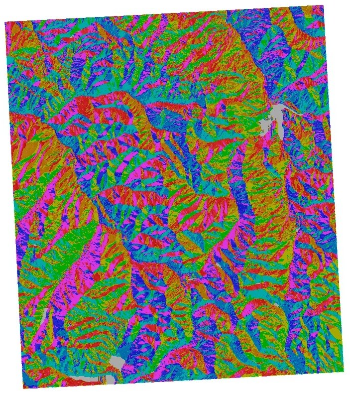
The area I selected to base the following images upon is an area of Colorado Springs, CO. I chose this area because it contains a lot of mountainous terrain as the Rocky Mountain Range runs through it. The area of Colorado Springs, CO depicted in these images is located at 38.8338889, -104.8208333. The datum used in creating these images was GCS NAD 1983 and the UTM zone of the datum is zone 12. The projection used in creating these images was a transverse mercator.

Image #1: Shaded Relief Model

Image #2: Slope Map

Image #3: Aspect Map

Image #4: 3D Projection

Monday, May 9, 2011

Map Projections in ArcGIS

Projection #1: GCS WGS 1984/Mercator
WGS 84 is a global datum complete with a horizontal and vertical datum. It defines the shape of the earth and is complete with latitude and longitude coordinates. The Mercator projection is a cylindrical projection that preserves the direction and shape of features on a map. The WGS 84 differs from the Mercator projection as the WGS 84 isn't a map projection, it's a datum which just defines the origin and orientation of a map. Selecting the datum is the first step in creating a map projection. WGS 84 could be used in portraying a Mercator projection.

Projection #2: Cylindrical Equal Area/Sinusoidal
In the Cylindrical Equal Area projection, the area is preserved while the shape and distance is heavily distorted. It is made using a cylinder and compresses north-south latitudes. In the Sinusoidal projection, the area is also preserved while the shape is heavily distorted and the distance is preserved along parallels. It is a psuedocylindrical projection and a cylinder is also used. In the Sinusoidal projection, the north-south scale and the east-west scale are the same throughout the map. In both of these map projections, the features are relatively similar as they get stretched and distorted towards the north and south. The Sinusoidal projection, however, portrays the features at a much smaller scale than the Cylindrical Equal Area projection.

Projection #3: Equidistant Conic/Equidistant Cylindrical
In the Equidistant Conic projection, distance is preserved while shape and area is distorted. It is made using a cone and has constant parallel spacement. In the Equidistant Cylindrical projection, distance is also preserved while shape and area is distorted. It is made using a cylinder and north-south distances are neither stretched or compressed. In the Equidistant Conic projection, features seem to be compressed, while in the Equidistant Cylindrical projection, features seem to be stretched south a bit.

Wednesday, April 20, 2011

Neogeography


View A Great Way to Spend a Night in Hollywood in a larger map
     Neogeography allows ordinary people to access maps created by others like themselves via the World Wide Web. It can either be extremely useful or completely useless; it all depends upon how knowledgeable the author of the map is. If the map has been created by someone very familiar with the area being mapped, then it will most likely be a trustworthy and useful form of navigation. However, if the map has been produced by someone unfamiliar with the subject, then it will most likely be a very poor representation of the area and will not be able to be used for accurate navigation. It is extremely important to make sure the author of the map is a trustworthy source who seems to be very well-informed about the area being mapped. This will insure that your map is in fact accurate.
     I created the map above, “A Great Way to Spend a Night in Hollywood”, because the area I chose to map is one in which I’m very familiar with. I knew the exact location of every point, polygon, and line I chose to include on the map, so I was certain I’d be able to provide the reader with an accurate representation of that area of Hollywood. I’m also knowledgeable on each of the entities included on the map, so I knew I’d be able to provide the reader with accurate geotags.

Tuesday, April 5, 2011

USGS Topographic Maps

1. Beverly Hills Quadrangle
2. Canoga Park Quadrangle, Van Nuys Quadrangle, Burbank Quadrangle, Topanga Quadrangle, Hollywood Quadrangle, Venice Quadrangle, and Inglewood Quadrangle
3. 1966
4. National Geodetic Vertical Datum of 1929, North American Datum of 1927 (NAD 27), and North American Datum of 1983 (NAD 83)
5. 1:24,000
6.
a) 1:24,000
   (1:24,000)5
     5 cm:120,000 cm
     100 cm in 1 m, so 5/100:120,000/100
    .05 m:1200 m
     5 cm on the map is equivalent to 1200 m on the ground
b) 1:24,000
   (1:24,000)5
    5 in:120,000 in
    63,360 in in 1 mi, so 5/63,360:120,000/63,360
   .0000789 mi:1.894 mi
    5 in on the map is equivalent to 1.894 mi on the ground
c) 1:24,000
    x:1 mi
    x:63,360 in
    x = 63,360in/24,000
    x = 2.64 in
    2.64:63,360
    1 mi on the ground is equivalent to 2.64 in on the map
d) 1:24,000
   (1:24,000)3
    3:72,000
    3km:72,000km
    x:3 km
    3 km = 300,000 cm
    x = 300,000cm/72,000
    x = 4.17 cm
    3 km on the ground is equivalent to 4.17 cm on the map
7. 20 ft
8.
a) 34°04'30" N 118°26'15" W
    34+.067+.008   118+.43+.004
    N 34.0678° W 118.434°
b) 34°00'25" N 118°29'50" W
    34+.00+.007   118+.48+.014
    N 34.007 W 118.494
c) 34°7'25" N 118°24'30" W
    34+.17+.007   118+.4+.008
    N 34.177° W 118.408°
9.
a) 560 ft
    1 m = 3.2808399 ft
    560 ft/3.2808399
    171 m
b) 140 ft
    140 ft/3.2808399
    43 m
c) 620 ft
    620 ft/3.2808399
    189 m
10. 11
11. 3763, 362
12. 10,000 ft x 10,000 ft = 100,000,000 sq ft
      100,000,000 sq ft/3.2808399
      30,480,000 sq m
13.


14. Difference between the geographic north pole at 0°48' E and the magnetic north pole at 14° E
      Magnetic declination = 13°12' E
15. The stream is flowing south
16.

Tuesday, March 29, 2011

Three of my Favorite Maps


Map 1: Active Volcanoes of the World http://pinknpurplelizard.com/blog/wp-content/uploads/2010/04/fault-line-map.gif
I find this map helpful because it provides a simple and informative image of the various plate boundaries and volcanoes located on the Earth. It also provides the reader with information regarding what kind of plate boundary is located between each plate which I find helpful as well. I really enjoy this map because it's very easy to read and understand. When I've studied maps regarding Earth's plate boundaries and active volcanoes in the past, I've found them rather hard to read as they've been too complex.

Map 2: Agricultural Map of South America http://go.grolier.com/map?id=mtlr038&pid=go
I've recently become very interested in South America as I took a course about it last quarter, and have really enjoyed studying the various agriculture coming out of its countries. I really like this map because it provides the reader with an easy to read and informative illustration of how different kinds of South American land are best suited for different kinds of agriculture.
 Map 3: Starbucks Center of Gravity, Manhattan http://infosthetics.com/archives/starbuckscenterofgravity.jpg
This map illustrates the number of Starbucks located in Manhattan and specifically points out the center of the city as containing the most. I really enjoy this map because it's amazing to see how close together the coffee franchise decides to build their stores.